Really, Really Bad Logos
Of all the Cardinal Sins of Logo Design, the seventh one is the heaviest: Use tone-deaf graphics or wording that subject the client to criticism or ridicule.Here are some spectacular logo fails that businesses have actually paid to design and deploy:
| This brand's message is loud and clear: their furniture is as American as… as it gets. |  |
|---|---|
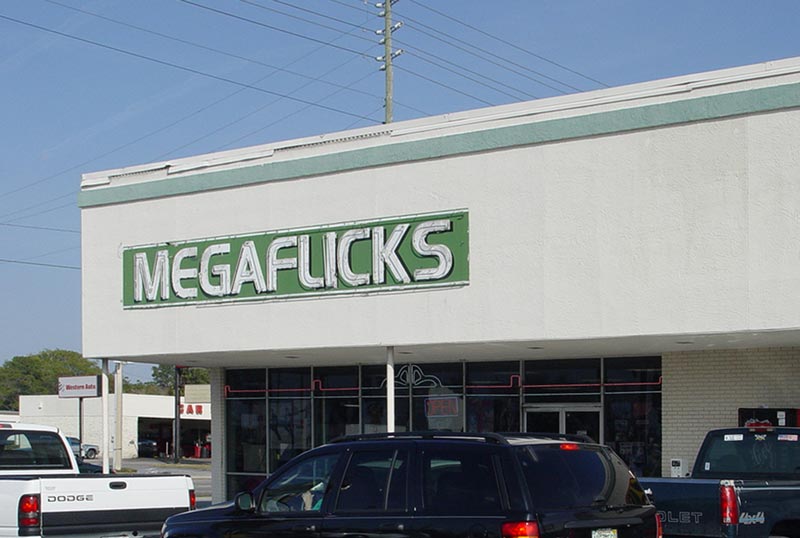
| This is either a double entendre describing their motion picture inventory or an epic design fail.
Pro tips:
|  |
| A conscientious designer ought to exert themselves to read the text they are typing in. …Especially in this case, when it's a mere two words - not three!
And yes, ALLCAPSANDNOSPACES can look trendy, but blindly following trends can backfire. |  |
| If they ever get an unhappy customer, at least they can always say they've given them a fair warning. |  |
| Is this pharmacy trying to tell us they carry prescription ED meds? |  |
| This logo is suggesting the clinic is looking to take care of more than your tooth ache. |  |
| These computer doctors may need to pay a real doctor a visit. To check their eyesight, of course (what did you think?), because that computer mouse doesn't look anything like the letter U. …Or like a computer mouse, for that matter. |  |
| I think I'll pass on the syrup. If you were sceptical before that a bad logo could impact sales, what about now? |  |
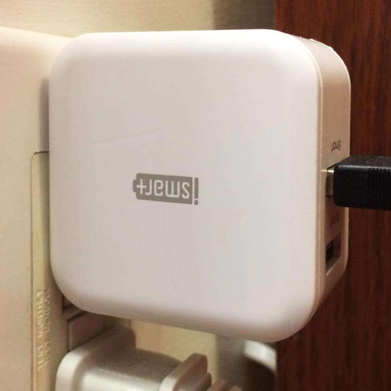
| If your gadget's battery is running out of "JEWS", you can add [+] some, with this self-proclaimed iSMART device. Not so iSMART when it's upside down, apparently. |  |
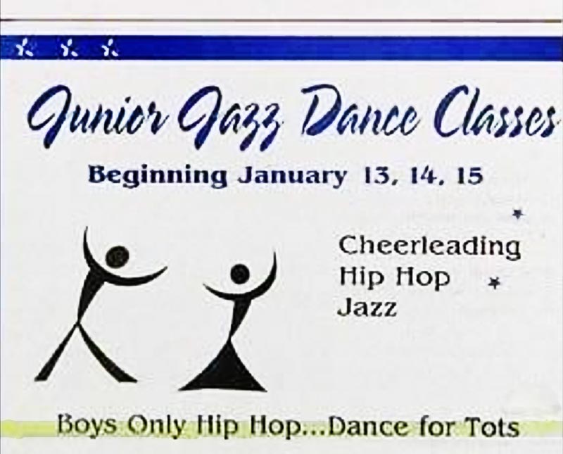
| Ah, dance! Nothing quite like it to send the pulse racing and the imagination flying. But may be a bit premature for the age groups mentioned. |  |
