What little sense of industrial design I have, has been seeded in me during my undergrad years at Voenmeh in Leningrad, Soviet Union (now St. Petersburg, Russia).

Soviet military/aerospace design philosophy’s core aim was to keep its user alive, through simplicity of use and maintenance, and maximum performance at a given cost. Visually, it boils down to plainness taken to such an extreme it can be called nudity or coarse honesty:
- If something is designed to come apart, do not hide the seams or fasteners.
- Conversely, do not draw fake seams or lines.
- A straight line is better than a curve; a consistent curve is better than a combination of different curves.
- Usage made obvious through shape and placement is better than a textual or graphical label.
- Do not make materials pretend to be other materials, or take on an unnatural for them role.
- If it works well and is cheap to make but appears ugly, so be it – it’ll grow on its users over time.
This often runs awry of the Western design sensibility where things are beautified and embellished with originality to move merch and bolster the designer’s profile. But can stark Russki design be domesticated and have its place in everyday or extraordinary things?
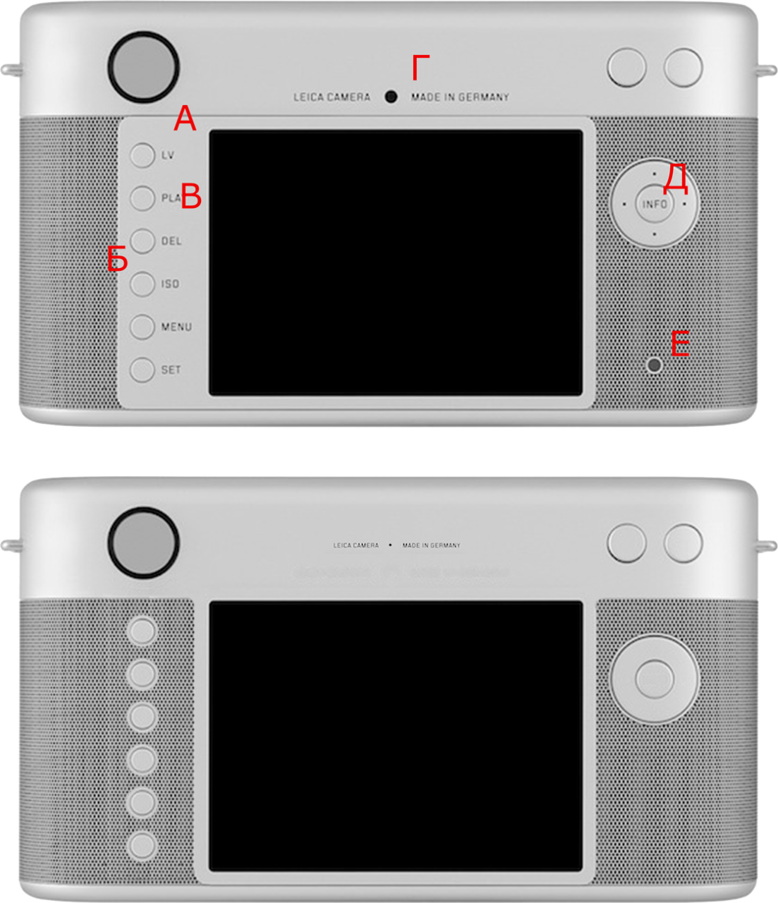
Jony Ive and Marc Newson, famous designers behind iconic Apple products among other innovations, have brought their talents to bear to give a truly unique (limited edition of one) design treatment to the Leica M series digital rangefinder camera. The camera will join 40 other unique items to be auctioned off at Sotheby’s in New York on November 23rd 2013. The camera’s sale is estimated to raise $500-750K for The Global Fund to fight AIDS, Tuberculosis and Malaria. Needless to say, Jony Ive and Marc Newson have done an incredible job that represents the very best of Western design. The top picture is the back of this camera as designed by Jony and Marc.
This bottom picture represents my Russki attempt. Specific comments:
А: Given there is no functional separation between the top and the display, we eliminate the “false” frame line. The “honest” line at the bottom stays, as functionally the bottom on Leica M is removable.
Б: The flat area to the left of the display appears to be solely a printing surface for the labels. It kicks the design off-balance, making the camera look heavy on the left. An ugly compromise on what is supposed to be a product of few compromises, certainly from the design perspective.
В: …Which brings us to the question: Do we even need those buttons labeled? We photogs know our cameras and can operate them by touch without looking. None of these buttons’ functions are destructive on a first press (even delete would generally ask for a confirmation), and press-and-hold can easily be made to display the legend for these buttons on the rear monitor. The front buttons have no labels, the zoom buttons have no labels. We want to be clean and consistent. Everything screams “eliminate the labels”.
Г: Premium products don’t need loud branding. Small and tasteful is the way to go.
Д: Speaking of superfluous labels, “INFO” is almost comically so. Everything is information, so by saying “INFO” it is not giving us any info. On the same note, everyone knows how 4-way switches operate, we do not need a tiny arrow (or dot!) reminding us that left is left, right is right, top is top, bottom is bottom. Eliminate.
Е: This appears to be an activity LED. If so, illuminate the gap around the “INFO” button instead, and eliminate the separate LED “hole feature”.
I have no doubt the camera will sell fine as-is, and hope it brings in a lot of money for The Global Fund to fight AIDS, Tuberculosis and Malaria.
Nov 23 update: the camera has sold for an amazing $1.805 million!